 Facebook
  Twitter
  Soundcloud
  Youtube
  Rss
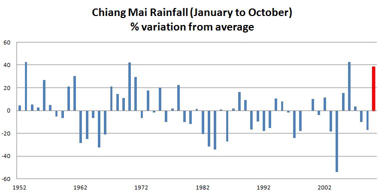
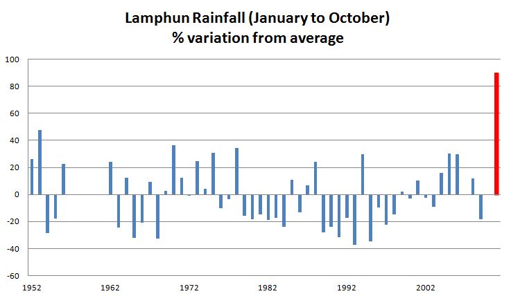
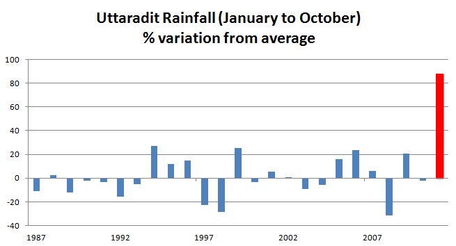
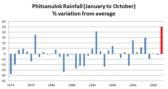
Rss Here are some more graphs showing the percentage variation from the average for rainfall in Chiang Mai, Lamphun, Uttaradit and Phitsanulok. The red bar is the 2011 figure. The Chiang Mai graph is based on a different (more recent) data series to the graph I provided last Friday, and the 2011 is a little less exceptional given the very high falls in 2006 (in addition to 1953 and 1970). However the graphs for Lamphun, Uttaradit and Phitsanulok underline just how wet 2011 has been.
(Data, except for 2011, from the Hydrology and Water Management Centre for the Upper/Lower Northern Region. 2011 data from the Thai Meteorological Department. UPDATE: Please note, graph headings should read January to September.)