 Facebook
  Twitter
  Soundcloud
  Youtube
  Rss
Rss Over the last year or so there has been a lot of discussion about the extent to which Thailand’s inequality has contributed to political conflict. One line of argument is that the red shirt movement derives some of its political momentum from worsening inequality.
So, what do official data suggest about inequality trends over the past 10 years.
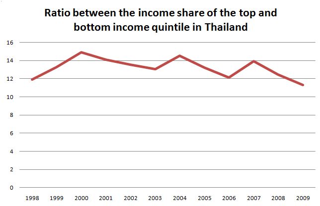
The regular household socio-economic survey (last undertaken in 2009) provides (among many other things) data on the percentage of income earned by the various income quintiles. For example, in 2009, the income share of the most affluent 20% of the population was 54% compared to only about 5% among the poorest 20%. That’s a pretty big difference!
But how has this changed over the past decade. The following graph sets out the ratio between the percentage share of the richest 20% and the poorest 20%. In 1998 it was about 12, it has risen to around 14 a few times since but by 2009 it was about 11. (An image of the original spreadsheet is here.)
Of course, there are plenty of problems with this sort of data. The rich are hard to survey and they are very good at under-reporting their income. And an analysis of assets, rather than income, may tell a different story.
But these figures do suggest that there is more work to be done to get a clear picture on recent trends in Thailand’s inequality and the effect of these trends on political conflict.