 Facebook
  Twitter
  Soundcloud
  Youtube
  Rss
Rss 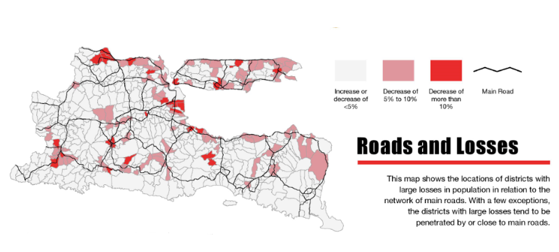
The Indonesian killings of 1965-66 marked a turning point in Indonesian politics, and rank among the most traumatic episodes in the country’s history. Indonesia’s transition to democracy in 1999 was followed by a flurry of work by those seeking to comprehend the events of 1965, unfettered by the preceding New Order Regime’s suppression of open discussion of the subject. However, absent from the large and diverse literature that has emerged over the past two decades is a systematic effort to analyse, using demographic and spatial concepts and data, the dynamics of the killings.
The project on which the three infographics presented here are based is motivated by three propositions. First, given that an estimated 500,000 people were killed and that these killings were concentrated in a few provinces, prominent among them Central and East Java, they should have left a visible signature in any population censuses that were taken in these provinces soon after the killings. Second, the fact that censuses were indeed taken a few years before and after the killings suggests that the first proposition can be tested using demographic concepts and methods. Third, because the growing literature on 1965, which is primarily anecdotal and qualitative in nature, has identified a number of factors associated with the dynamics of the violence, and because there exist province-wide spatial and quantitative data from the 1960s that can speak to a number of these factors, many of these claims, hitherto evidenced by spatially limited and anecdotal information, can be tested at the provincial level.
The overarching goal of this project is to describe, using spatial and demographic methods and estimates, evidence of abrupt changes in population associated with the killings and then to identify factors that the data suggest played a role in determining spatial variations in the violence. In this sense, this project is a conversation with the vast scholarship on the subject that seeks to illuminate the killings using complementary but different methods and perspectives. Embedded in this process of confirmation (or refutation) of the existing scholarship is the ever-present possibility, realized in a number of instances, that new phenomena will emerge that have hitherto escaped observation.

Shining a light on police complicity in 1965
Katharine McGregor and Jemma Purdey look at the Ubud cancellations, the police and Indonesia's 1965 massacre.
The three infographics presented here should be interpreted keeping in mind several limitations, which are detailed in the in-depth research papers on which they are based. The first is that, in keeping with the demographic literature, the estimates of abrupt population change associated with the violence are based on a set of strong assumptions. If these assumptions materially deviate from the on-the-ground reality in any of the kecamatan or kabupaten included in the infographics, then the estimates for that specific area will be inaccurate. Second, the estimates are of abrupt population change, which is a composite of abrupt changes in not only deaths, but also in births and net migration. Because changes in all three of these phenomena will tend to move population in the same direction (i.e., downward) in an area experiencing violence, the estimates shown in the infographic are broadly indicative of spatial variations in the severity of the violence rather than in the killings per se. And third, each infographic focuses on a single phenomenon to the exclusion of other phenomena, presenting a view through a specific and narrow lens. These caveats notwithstanding, as the infographics and the underlying research hopefully demonstrate, the patterns that emerge when a province is viewed as a whole are quite compelling and line up with what has been written about the violence. As a consequence, it is not unreasonable to interpret new patterns revealed by these exercises as also likely reflecting real, on-the-ground phenomena during this tumultuous period, especially when they can be easily explained.
The three infographics presented here focus on two themes. The first of these themes is the infrastructure of mass violence, in this case evidenced by the repeated mention of trucks in the context of the killings. The image of the truck as a vehicle for the rounding up and taking away of victims to prison or, worse, execution, appears with unfailing regularity in accounts of the killings. Indeed, in order to carry out killings on as large a scale as occurred in the worst-affected provinces, large-scale infrastructure was necessary. The use of trucks to assist in the killings suggests that populations in locations that were more exposed to road infrastructure would have been more vulnerable to capture and execution than those that were not similarly exposed. The first infographic provides statistical evidence that, in East Java, kecamatan that were more exposed to the road network did indeed experience a greater degree of abrupt population loss than those that were less exposed.
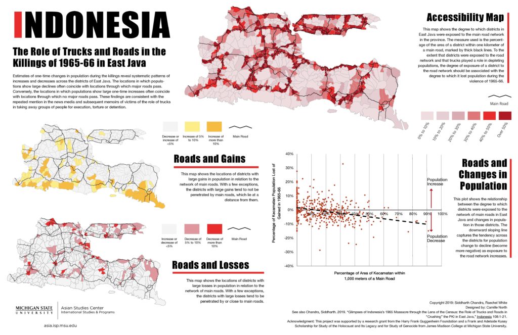
Click to see the larger infographic
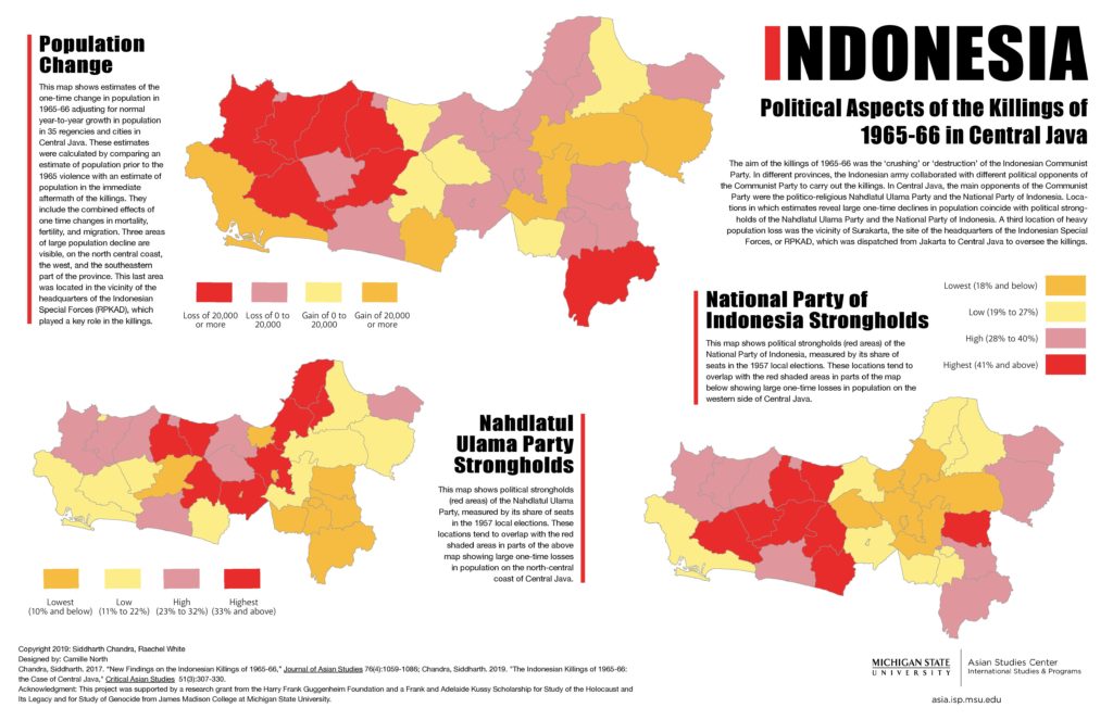
The second and third infographics focus on the second theme, the civilian organizations that opposed the PKI and collaborated with the Indonesian Army to “crush” the PKI. In East Java, the dominant civilian organization in opposition to the PKI was the Nahdlatul Ulama Party, whose youth organization Ansor and its militant wing Banser actively collaborated with the Army in the killings. The second infographic, for East Java, shows that kabupaten in which the Nahdlatul Ulama Party was strong, as reflected by its share of the vote in the preceding 1957 election, tended to experience larger abrupt losses in population than did kabupaten where Nahdlatul Ulama was not so strong. In Central Java where, depending on the specific location, either the Nahdlatul Ulama Party or the National Party of Indonesia (PNI) was the dominant party in opposition to the PKI, we again see that the loss in population is related to how strong the support for these opposing parties was, as measured by their vote shares in the 1957 election. The exception to this pattern occurs in the Surakarta region which, in spite of being a PKI stronghold, experienced severe population losses. This deviation from the above pattern can be explained by the fact that the Indonesian Army’s RPKAD (Resimen Para Komando Angkatan Darat), which was sent to Central Java with the objective of destroying the PKI, established its operational headquarters in the suburb of Kartasura near Surakarta.
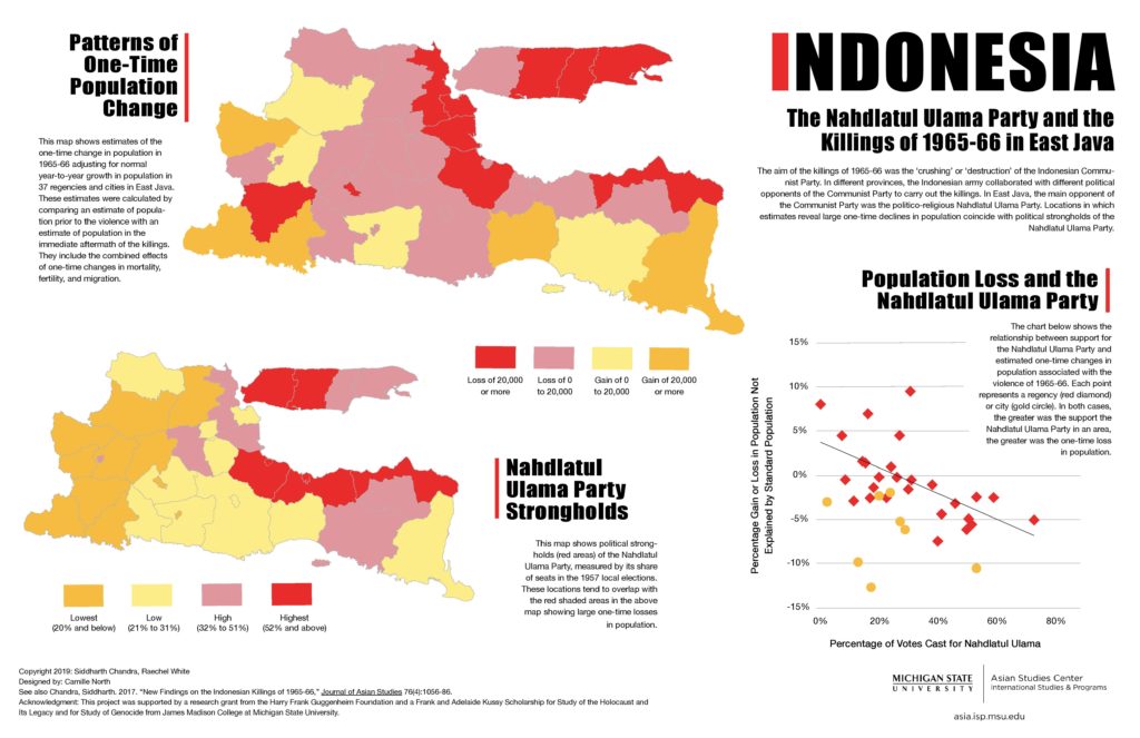
Click to see the larger infographic
Click to see the larger infographic
This project was supported by a research grant from the Harry Frank Guggenheim Foundation and a Frank and Adelaide Kussy Scholarship for Study of the Holocaust and Its Legacy and for Study of Genocide from James Madison College at Michigan State University.