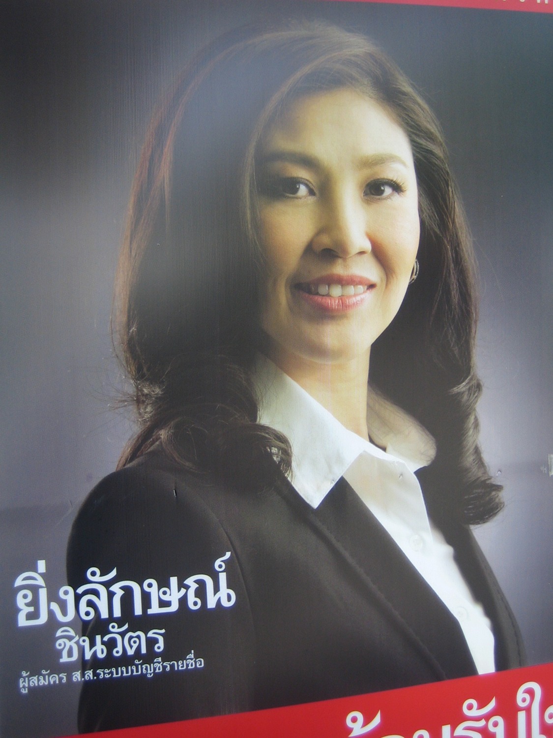
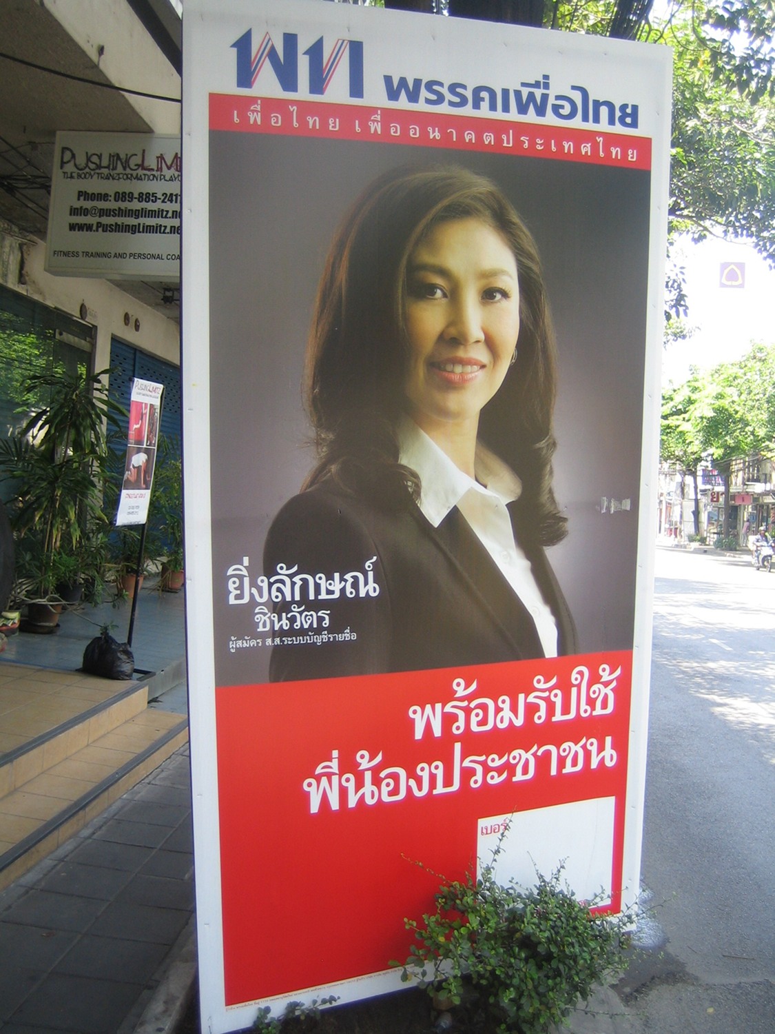
Over last weekend, Bangkok was smothered with posters of Yingluck Shinawatra. Probably most of Thailand too. The poster is the first shot in Pheu Thai’s election campaign, and what a shot.
First off, it is a far higher quality photograph than we’re used to on election posters. Its first message is simply “quality.”
Most election poster shots are as flat as the Central Plain. But look at the distance between her front shoulder, nose, and the studio backdrop. There is more depth than the distance between Abhisit and the horizon in the Democrat’s competing posters. She is brilliantly lit. She is 3D and she is real. By contrast, Abhisit has as much life as the cutout air hostess outside the airport lounge.
She’s been sexed-down rather than the opposite. The hair has been arranged to fall over her right cheek, making her face longer and squarer, losing its moon-round cuteness. Her skin looks a little puffy, something that would have been easy to correct by lighting or retouching. She is more mature and serious than her usual look.
The one element that conflicts with this mood is the hair. It’s long, and lush, and sensuous. It’s been lifted a little at the peak with gel, and swept at the tips, but it’s designed to look natural, in contrast to the clipped, sprayed and regimented bonnets of senior bureaucrats and army wives. Very feminine. The length of the hank on her left shoulder is especially striking. One taxidriver-consultant volunteered that the hair was too long and should have been cut to a more businesslike length. But the hair makes her not just 3D but touchable.
She is dressed in monochrome, in a white shirt and black jacket. The shirt’s collar is plain and the lapel of the jacket is unnotched. The outfit is more that of a lawyer than a businesswoman. The makeup is unobtrusive. She has no insignia and virtually no jewelry. There is a trace of an earring on her left ear but it is scarcely visible. The message of the costuming is simplicity and seriousness.
Compared to most election posters, the picture has been allotted more of the space, perhaps 15 percent more. The copy has been kept to a minimum, again to allow the image to dominate. Most strikingly, the point size of her name is probably smaller than on any other poster of this size, and the surname Shinawatra has been reduced even further.
The overall effect is rather cool and quiet. The backdrop is studio grey. She is static, ungesturing. Her look is bright but not as animated as she usually looks. The copy message (“Ready to service the people”) does not shout. There is less red in the whole poster than in most Pheu Thai campaigns.
The quality of the shot and the skill of the presentation are reminders that Thaksin has always understood the importance of communication and especially of visual communication. The poster subtly restates the Shinawatra wealth and business success.
The poster presents Yingluck as simple and serious, but above all as real, physical, close enough to touch. It cleverly emphasizes how much Abhisit is aloof, stiff, distant. The Democrat’s rival campaign, showing Abhisit surrounded by smiling people, always looked desperate and now looks doomed. This poster is a brilliant bit of visual populism.
The overall feel of the Yingluck poster is cool, quiet, unaggressive. The disturbing factor is the hair which is aggressively feminine. Most female political candidates have their hair clipped and controlled. The rules and conventions of Thai politics have been shaped by the male domination of the political world. Yingluck’s hair presents a tricky challenge. How do you attack this without looking like a brute?
 Facebook
  Twitter
  Soundcloud
  Youtube
  Rss
Rss 
